Mar 152021
 

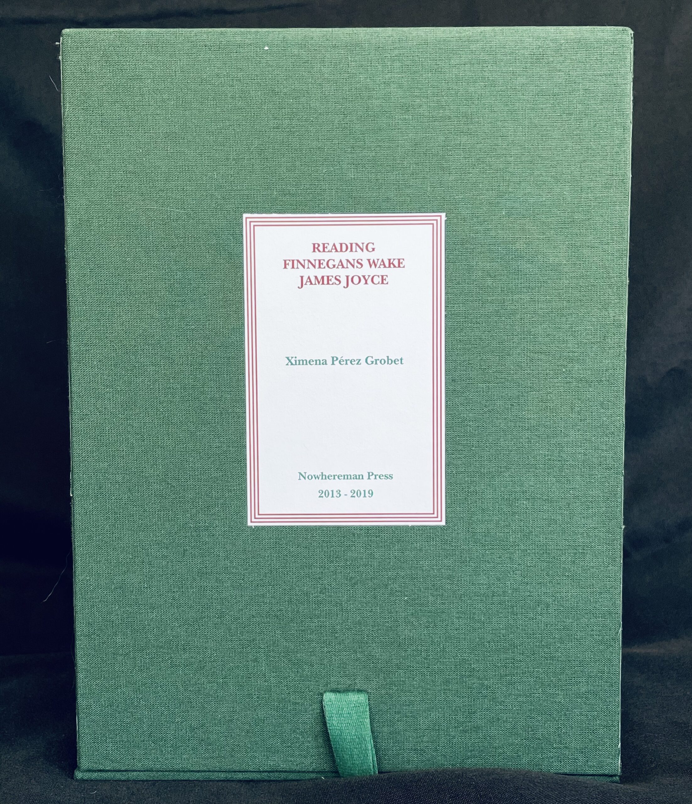
We are extremely pleased to announce that Ximena Pérez Grobet’s artist book, Reading Finnegans Wake, is on its way to the Thomas Fisher Rare Book Library at the University of Toronto. It will become part of the DeLury Irish Literature collection (which has upwards of 300 Joyce works, including approximately 30 copies of Finnegans Wake) and the Marshall McLuhan Library (which has several copies of Finnegans Wake, heavily annotated by McLuhan – he claimed to have “cracked the code” behind the book). It is, arguably, the perfect home for the work.

Ximena‘s interpretation and reconstruction of James Joyce‘s masterpiece, Finnegans Wake, is one of the most extraordinary examples of an artist book we’ve had the pleasure of representing. Ximena had the Faber & Faber original disbound, had the textblock cut into strips, maintaining the original order, line by line and page by page, and then spent several years *knitting* the textblock back together. It is a work of mad genius, and the result is a visual and tactile gem.

I actually began working with Ximena and her Nowhereman Press because of this book, first working with some of her other books while she was finishing this masterwork…all the while, hoping she would allow me to represent it. Several years ago, I had stopped by her booth at CODEX – my attention caught, in large part, by the fact that she was sitting behind her table casually knitting strips of paper together on a pair of needles. The idea enchanted me, in no small part as I could hear my Belfast-born, Joyce-lover grandfather laugh and say, “Well, it’s no more nor less comprehensible than the original.” It was another year or so before she finished it, and the result is simply brilliant. Bound into four volumes, matching the four books of the work, it is a clever, elegant, and lovely artistic interpretation of the work.

“Finnegans Wake is a novel by James Joyce, written in 1939. It is considered one of the most complex books in English literature, as well as being unique in its experimental writing style. The purpose of the work is to visually display this complexity. Using a classic 1965 edition by Faber & Faber, the book was disbound, woven and rebound, respecting the original order of the pages and preserving the same cover. The new edition consists of 4 volumes covering the four parts and 450 pages of the original edition.” [Artist Statement]

Jan 202018
 

Consider this a teaser, as the images do not capture just how stunning these volumes are. We are pleased to have 3 of the 5 deluxe editions (one stayed in Ireland and the other at Yale). Each of the 5 is uniquely bound in a binding reflecting issues embodied in the 1729 text, modern Ireland, and the world as a whole. We are pleased to have and to offer Abortion, Homelessness, and Religion.

If you have not seen it, the Irish Times article offers a great overview. A description of the standard and deluxe editions follows the images. I’ve also reposted some images of the standard edition and content at the very end. It is a remarkable work.

Swift, Jonathan; O’Kane, David [illus]; Carpenter, Andrew [intro]; Traynor, Jessica [poetry]. A Modest Proposal. Dublin, Ireland: The Salvage Press, 1729 [2017]. Limited Edition. Tight, bright, and unmarred. Halfbound, black leather spine and foredge, red leather spine label, gilt lettering, marbled paper boards, printed in red and black ink; matching drop-spine archival box with inlaid Irish porcelain. Imperial folio. 64pp. Illus. (b/w plates). Lettered limited edition, this being IJK. [N.B. there are 4 additional copies, i-iv, hors de commerse. Deluxe copies, 1-5, are each in a unique binding reflecting an issue confronting modern Ireland (homelessness, abortion rights, direct provision, religious persecution, and affordable housing) in “hand dyed alum tawed goatskin with reverse offset printed inlays and red calfskin borders, 22c gold hand lettered title, red handmade paper doublures with blind tooling, distressed silver endpapers with 23.5c gold leaf highlights, graphite top edge, red calfskin headbands” by Kate Holland and including an additional portfolio containing a full suite of the lithographs and a full suite of the poems. Fine in Fine Archival Box. Hardcover.

“This publishing of A Modest Proposal was produced to mark the 350th anniversary of the birth of Jonathan Swift in 1667. First printed in 1729 by Sarah Harding ‘on the Blind Key‘, Dublin.

Designed, typeset and letterpress printed by Jamie Murphy with much grateful assistance from Niamh McNally, Sarah O’Neill and Phelim McGovern. The type employed is 22 point Monotype Caslon, an interesting cut quite close in character to William Caslon’s ‘Roman and Italick’ types of the late 1720s. The type was originally cast into founts by Neil Winter at The Whittington Press from matrices acquired from the Oxford University Press. The book was printed on a Western style Double Crown proofing press at Distillers Press, NCAD, Dublin. Andrew Carpenter has introduced the edition. Jessica Traynor has supplied nine new poems in response to the original text. David O’Kane has scratched the ten illustrations which have been editioned from lithographic stones by Michael Timmins at his workshop in Stoneybatter. The book has been printed on 250gsm mouldmade paper from the Zerkall Mill, Hürtgenwald, Germany, supplied by John Purcell, London. Based in Wiltshire, UK, Jemma Lewis has designed and produced the marbled papers based on marble patterns found at St. Patrick’s Cathederal where Swift was once Dean. Eleanor Swan has produced the porcelain inserts for the standard copies at her studio on the grounds of Russborough House, Co. Wicklow.” (Publisher statement)

Sep 302017
 

We have a had a run of interesting, unusual fine press and/or artists books land recently, but this stood out and I thought I’d throw up a quick overview:

Julie Rafalski, Tahu Deans and David Henningham re-enacted Cold War psychic drawing experiments in a Leipzig building that had formerly housed an East German supercomputer. They also reconstructed the computer as a set to be reconfigured and photographed.

These pictures, films, drawings and transcripts make up the content of this book. Operating like the distinct CMYK dots that merge optically to form a full-colour picture, the artists have worked together to take the viewer through corridor spaces, doctored photographs, and a psychic spying apparatus redolent of the building itself. Not every page is accessible without the use of a knife.

And because gilding the lily is always a good thing…

The books are editioned using a vector-based system so that each book is assigned a non-hierarchical relationship to the others.

Sep 252017
 

We have just received three copies(!) of Jamie Murphy’s simply brilliant edition of J. Swift’s Modest Proposal. We will soon(ish) have three(!!!) copies of the deluxe edition, too. I have trouble reducing to words just how much I adore this work, but if you will bear with the simulacra of various images, I will try to convey the exquisite power and delicacy in execution embodied in this work. As you likely know,  A Modest Proposal For preventing the Children of Poor People From being a Burthen to Their Parents or Country, and For making them Beneficial to the Publick, more commonly known by its short-title, is Swift’s 1729 satirical pamphlet suggesting the impoverished Irish might ease their economic troubles by selling their children as food for rich gentlemen and ladies. It was a hastily printed pamphlet, modest in execution. The Salvage Press’ edition is not…it is rich in dark leather and marbled paper and monumental in size: imperial folio.

Jamie approaches the work from both a modern-situational aspect, but also from a profoundly personal one, with not one but two children with a rare genetic condition. “I had heard of A Modest Proposal years before but hadn’t read it until this period. The text seemed relevant and current – are the Irish not still in a shocking financial condition? Are we not still being plundered by absentee landlords? Are our children not about to incur the fallout from a previous generation’s mistakes? I started to think about reprinting the text. My daughter Olivia was born in 2016, presenting signs of the same genetic condition as my son. I knew they would have to be involved, and in one way this project was designed to mark their births.”

Jamie approached David O’Kane to illustrate the work, as he felt David’s preferred technique, scratching an image directly onto lithography stones, would create a rather haunting effect. Jamie’s suggesting that David use images of his children for inspiration, while challenging, nevertheless helped shape and shadow the remarkable power of the images.

David notes, “Swift’s voice was critical of those in power but also of the exploited masses and their deference to that power. In this sense it is still critically relevant today. The baby in the deanery dining table image appears to be eating her own hand, while simultaneously pointing an accusatory hand toward the viewer. The empty chairs await the hungry landlords. The question raised by the image is whether we want to pull up a seat at this horrific meal or find another way of setting out the table?”

Jamie asked Jessica Traynor to write nine new poems, each responding to the original text. Like the others, her contribution also integrated current events. As Jessica recalls, “So much history unfolded around me as I worked on the poems – the migrant crisis bled into Brexit, bled into the Citizens’ Assembly, bled into the Trump presidency, and I wrote poems in response to all of these events. But it would be impossible to write about the Ireland of the 21st century without writing about direct provision [the system of dealing with asylum seekers].”

The result is that rare Aristotelian work, with the whole being so much more than the sum of its parts. It is wry, and soul-draining, and funny, and touching, and brilliant, and challenging, and so much more…all once. You can return to it over and over and find something new in the image, prose, poetry, and/or design that you missed before. It is, simply, brilliant.

Jamie commissioned a wonderful video that explores the creation of the work and The Irish Times wrote this wonderful article on the work, rich with additional information and well worth a read. Enjoy both. We hope to have a standard at the Boston ABAA book fair, though there are fewer than 10 copies remaining. A complete description can be found here. I will almost certainly have one of the Deluxe editions, however, as they are a fair bit more dear…but that is for another time [teaser: 5 unique back-painted bindings, each reflecting a major theme]. Finally, that Jamie is barely 30 bodes well for the future. He has produced some remarkable work (see, e.g. Albert, Ernest & the Titanic)…but this hints of things to come. I, for one, cannot wait.

A Modest Proposal from ror conaty on Vimeo.


Jul 242017
 

I have had the great pleasure of working with Gabby Cooksey since she burst forth from North Bennet School and began inflicting her genius upon the world. I had the great pleasure of placing her first binding in Univ. of Virginia’s Special Collections and the greater pleasure of watching her explore, evolve, and expand with each new work. I have said since I saw her first work that she makes design decisions as a new, now young, binder that I would expect from one with decades under her belt… Part of this is to NBS’s credit, but much has to do with Gabby’s profoundly subtle and sophisticated way of looking at her projects and finding elegant solutions at nearly every turn…

It was not long before she branched out and began writing text, creating art, and printing all elements of some projects. Thus we have today’s gem: The Book of Penumbra, of which Gabby writes,

“Death has always fascinated me because it happens to all of us yet no one talks about it. I wanted to see what other cultures personified death as through myths and legends. The gods in this book are very hushed and for some, even if you speak the name, you’ll be cursed. I wanted this book to be shadows, to be played in the light. I chose a delicate paper so one could see through to the page behind it. The text is in all sorts of shapes because I wanted each story to represent the god being told about. For instance, Sedna is in the shape of drowning, Anubis is his eye, Mac is a pit with someone at the bottom. The borders are all plants, roots, and things found on the earth. Some represent death like the poppy, and the yew tree.”

Completed in an edition of 23, bound in wraps, and housed in a box with an inlaid coffin, it is a beautiful bit of work. As she is seldom content with ‘exquisite’, I received a package out of the blue and found a one-off art binding of the book with seven skulls suspended by gold in the cut-through front board (insert above). Always pushing, always expanding…ever brilliant. I am always excited about what she will produce next. Explore the book below…

Jun 012017


Yes, despite what we complain about, there are things we enjoy about the approaching summer. That includes attending the Rare Books and Manuscripts Section conference in Iowa City! Lux Mentis will be part of the Bookseller showcase this year, along with many other fine booksellers. We are especially excited to feature our selection of book arts and primary source materials in keeping with this year’s theme, “The Stories We Tell.” We are also sponsoring the panel: “MATERIALIA LUMINA: THE CONTEMPORARY BOOK IN ITS HISTORICAL CONTEXT: PHILOSOPHICAL MUSING OF THREE MASTER PRINTERS” featuring Peter Rutledge Koch, Russell Maret, and Gaylord Schanilec.

As a large part of our mission we aim to support especially book arts and book narratives, so we will have a good selection of artist’s books and both pictorial and literary narratives. A few of our latest acquisitions will be featured including works by Ximena Perez GrobetLorena Velázquez, Alexandra Janezic, Maureen Cummins, and Sam Winston. As usual, we will also bring a few challenging and provocative things.

Before the show, we will be attending the Chicago Book & Paper Fair and during the week of RBMS we will also be attending the Solstice Book Fair organized by book artists, Alexandra Janezic and Candida Pagan.

Until then, keep reading, keep collecting! See you in Iowa City!


Apr 242017
 

For those who have seen the proto-type for Maureen Cummins’ newest work we were showing in CA and NYC, we are pleased to say that the work is complete and ready. Maureen just forwarded the following prospectus, which summarizes the work quite perfectly:

The/rapist is an investigation into the gendered history of psychosurgery, as illustrated by the career of Doctor Walter Freeman (1895-1972). A Professor of Neurology with no formal training in either surgery or psychology, Freeman popularized the pre-frontal lobotomy, an operation in which nerve connections to and from the frontal lobes—the seat of human emotion, creativity, willpower, and imagination—are severed. A self-styled showman who drove ice picks through his patients’ eye sockets, rode around in a “lobotomobile,” and conducted a 1953 tour dubbed “Operation Ice-Pick,” Freeman freely admitted that his work created a “surgically induced childhood,” with many “failed outcomes.”

It is a history that raises numerous and disturbing questions about patients’ rights, the abuse of institutional power, and the disproportionate targeting of women. Of the 3,500 or more patients that Freeman operated on, twice as many were female, many depressed or suicidal housewives. Even now, electroshock—Freeman’s favored method of anesthesia—is applied to female patients two to three times as often as males.

In the opening pages of the book, Cummins uses the analogy of physical rape to suggest the way in which psychosurgery became a form of violence-against-women (and men) perpetuated in the name of medical progress. The concept is textually and visually reinforced as the reader pages through the book: the title, “The Rapist” morphs into the word, “Therapist?” while a laser-cut hole bores through the book, penetrating silkscreened images of patients’ heads. These headshots, “before-and-after” photographs that Freeman used to document his work, are re-contextualized, with lines of typography mimicking blindfolds, reclaiming for these patients a measure of dignity, humanity, and anonymity. Throughout the book, the artist’s mordant sense of humor is in evidence: The name Freeman transforms into “Free Man,” while found images—everything from advertising cuts of arrows and pointing fingers to reproductions of Freeman’s ice picks—serve as illustrations, providing ironic counters to the subject matter, often—as with the sunburst, moon, and encircling question marks—cleverly incorporating the hole.

Constructed entirely out of aluminum, The/rapist is inspired by the cold, hard surfaces of medical clipboards and equipment, as well as by Freeman’s actual tools, viewed by the artist in the Freeman/Watts collection at GWU, where she conducted her initial research. Pages of the book are laser-cut, burnished on one side, printed with multiple layers of text and imagery, “dimpled” to prevent scratching and wear, then mounted within rings to a sturdy baseboard. The text is printed in Frutiger, a classic mid-century sans-serif typeface. Images reproduced in the book are 19th century engravings, handwritten notes and text, as well as graphs and headshots from Freeman’s 1950 textbook Psychosurgery: In the Treatment of Mental Disorders and Intractable Pain. The book is housed in a burnished aluminum box with a screwed-down aluminum title plate. For exhibition purposes, copies can be propped up vertically, with the backboard acting as a stand, or positioned with the pages fanned out in a pleasing sculptural form.

Detailed images are available upon request. As you may or may not know, the prices for Maureen’s work step when a certain number of sales have been hit. As this is an edition of 40, we encourage you to let us know as soon as reasonably possible should you wish to add it to your collection.

Mar 292017
 

We want to introduce you to a remarkable new work by Sam Winston and Oliver Jeffers, A Child of Books.

“A little girl sails her raft across a sea of words, arriving at the house of a small boy and calling him away on an adventure. Through forests of fairy tales and across mountains of make-believe, the two travel together on a fantastical journey that unlocks the boy’s imagination. Now a lifetime of magic and adventure lies ahead of him . . . but who will be next? Combining elegant images by Oliver Jeffers and Sam Winston’s typographical landscapes shaped from excerpts of children’s classics and lullabies, A Child of Books is a stunning prose poem on the rewards of reading and sharing stories—an immersive and unforgettable reading experience that readers will want to pass on to others.” [publisher statement]

The book itself is a charming and beautiful tale and can be found here. The true depth and breadth of the work, however, can be found only in the deluxe editions…and is a bit more dear. There were two states of the deluxe edition, one, however, was an edition of nine and all are already gone, so we will ignore it. Interestingly, the other deluxe is an edition of eighty (80!!!)…a number seldom a good idea in deluxe editions and for good reason. This, however, is the exception that defines the rule. Best, it is clearly designed with both the private collector and the special collections library in mind.

This edition comes with three components, all housed in a colander box. First is a signed first edition of the standard book. Then there is the Process Book, designed by Lewis Trevor and Sam Winston with the assistance of Becky Elms. This book provides elements of a ‘making copy’, detailing and exploring the collaborative process Sam and Oliver went through producing the story and images. Stab bound in the Japanese style by Manuel Mazzotti (London), it provides a wonderful view into the evolution of this remarkable story. Finally, this edition comes with 19 archival fine art prints, inkjet printed with pigment ink onto Hahnemühle Fine Art Bamboo Natural White. Signed by both Sam and Oliver, each embodies a full two-page spread of the story, larger and absolutely stunning. For special collections, there is even a ‘teaching guide’ included to help facility academic use.

Each illustration is a blend of Oliver’s whimsical sketches with the ‘textual art’ Sam is so well known for…manipulating text to create image. Here the texts are drawn from classic children’s books, (e.g the huge furry, horned monster threatening a castle is created from text from Frankenstein, Dracula, and The Legend of Sleepy Hollow and then children escape by climbing down a rope made up of prose from Rapunzel). The blend of illustration styles and the tale itself creates a wonderful starting point to explore the nature of art and writing. It is, in brief, one of the very best things we’ve seen in a very long time. Additional information and images are available and can be found here and/or you are welcome to email.

Bonus: There is a lovely interview with Sam and Oliver, for those so inclined.

Feb 262017
 

The New York Antiquarian Book Fair is right around the corner! We have fashioned ourselves into a corner this year, literally. However, as always with amazing new delights to share! The gallery below is just a snippet of our booth in New York, link to our show list will be available next week.

As usual, a consistent selection of books arts, fine press, photography, ‘sex, death, and the devil’, in addition to our fondness for esoterica. We’ll have some ‘normal’ books too.

*If you would like passes to the New York Book Fair, please contact us*

SEE YOU THERE!!! #nyabaa17 #nyabf17

Feb 192017
 

We are starting what we hope/intend will be a regular element of the blog: images and/or video profiling various specific artists books. We debut with Jun Suzuki‘s metal meta masterpiece, In the Beginning. Part of Kaldewey Press’ artist book series (this being Kaldewey 7), it is an elegantly simple piece of work, concealing subtle complexity.

The limited edition of thirty-five is comprised of hinged metal sheets (oxidized) with red ink Japanese characters and the English equivalent in cut-out letters…and one letterpress printed leaf tipped in. It is housed in a slipcase designed ‘spine up’, so that the leave hang free.

The book illustrates the process of the creation of language. The last page includes the first sentence of the earliest known work of Japanese literature. The work is found in a handful of special collections and we have not found another copy in the market in at least a decade.

%d bloggers like this: